
Cards provide a content container for a single subject. Cards are typically used in a grid-style format using flex containers. This widget is particularly useful when you want to organize sections of content, but still make them stand out.
Card Widgets consist of three components, all of which can be manipulated.
- Card Title
- Card Content
- Card Button
Here's how to get started:
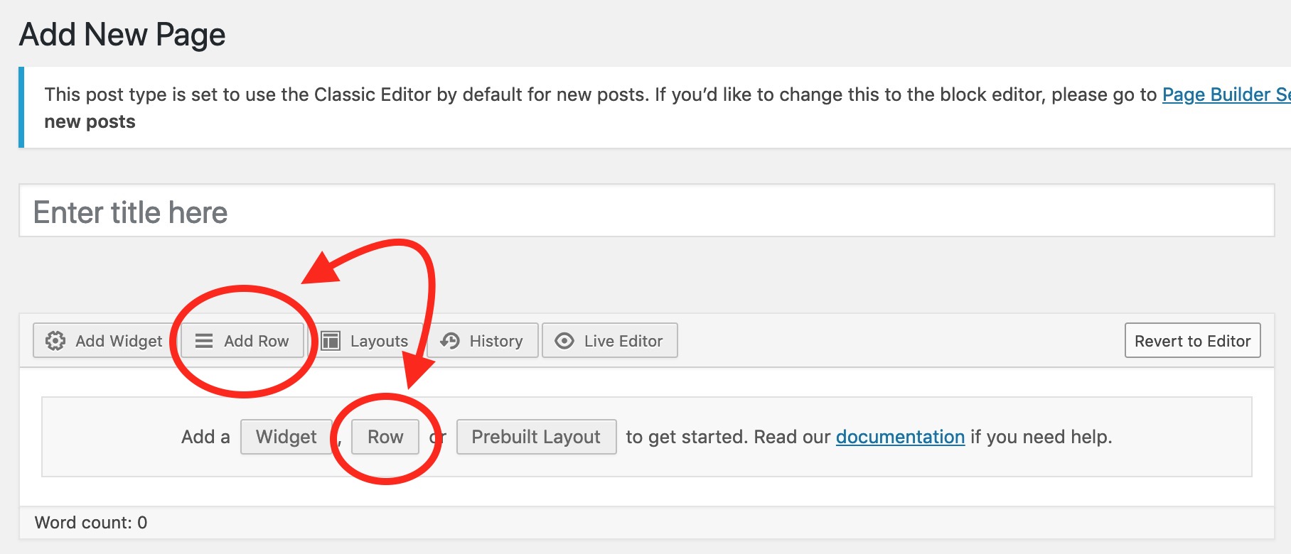
First you will need to add a row before you drop in your widget. To add a row: click on the "Add Row" option above the editor, or click on "Row" from the editor "Add a section." You can also right click and open the WordPress Menu and add a row from there.

Once you have selected the "Card Widget" from the widget menu and have dropped it into a row, add as many cards as necessary. You can also choose the number of cards that appear in each row, (minimum of 1, maximum of 6.)
")
Now it's time to start dropping in your content, including your card title and any text/images you would like. Be sure to edit your button text and drop in the URL for the site where you want your button to redirect to!

That's it! If you would like to preview your card widget before publishing it to your page, be sure to hit "Preview" in the top right corner of your WordPress page. To make your updates live hit the "Publish" button near the top right corner of your WordPress window.